Open source · MIT licensed View code →

Responsive testing that stays on your machine.

See your page across phones, tablets, laptops, and desktops in one focused workspace. Catch layout issues, compare designs, and hand off fixes—without sending your work to a backend.

  • No accountOpen and start testing
  • Local extensionNo extension telemetry
  • Open sourceInspect every line of code

Responsive workspace

Local only
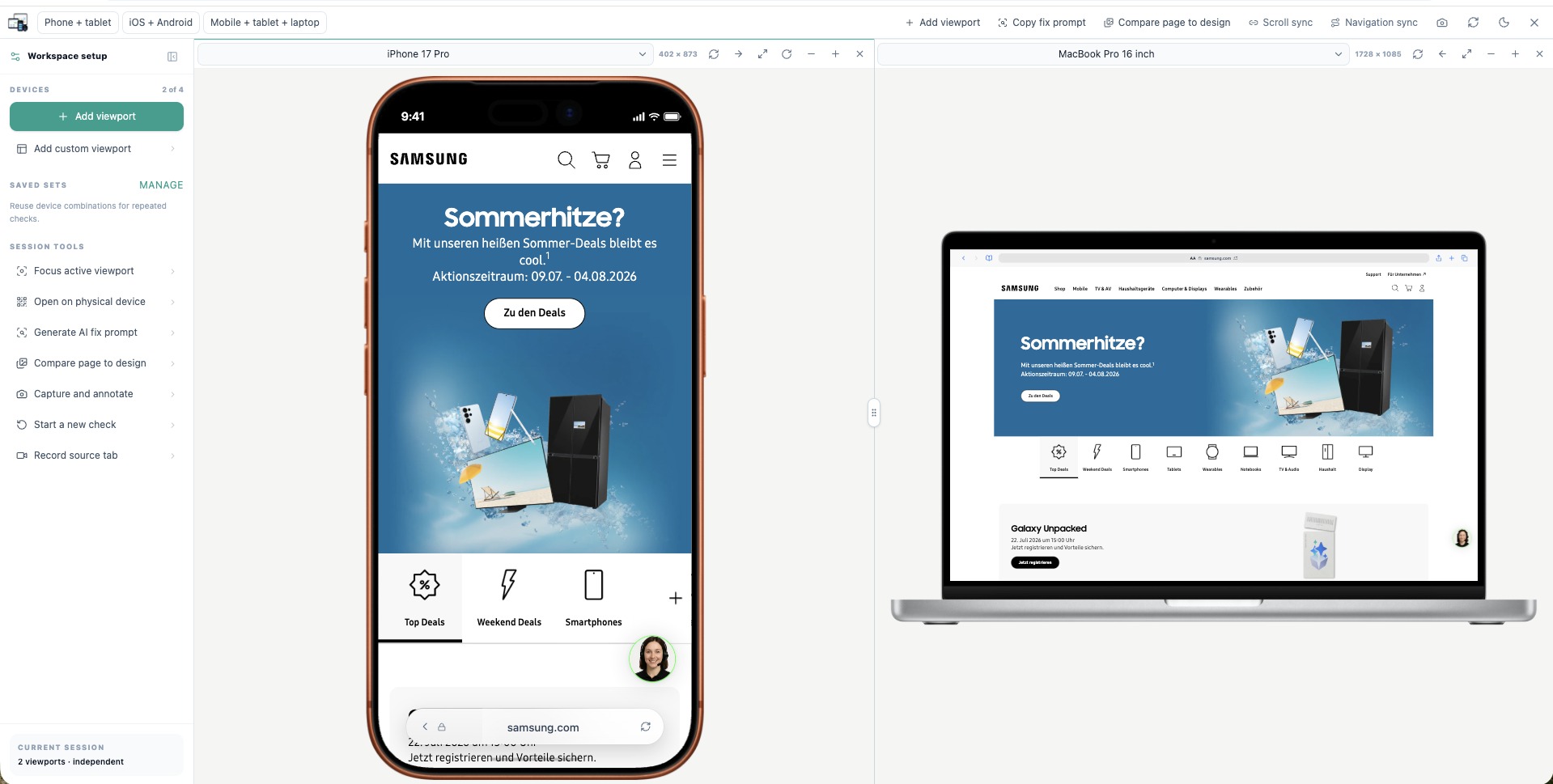
Mobile View & Responsive Tester showing a phone and laptop viewport side by side
Private by defaultNo cloud processing
70+device profiles
PhonesTabletsFoldablesLaptopsDesktopsCustom sizes

TRUST IS A PRODUCT FEATURE

Built in public.
Runs in private.

01LOCAL-FIRST EXTENSION

Your tested pages never become our data.

The extension has no account, advertising, telemetry, remote logging, or automatic uploads. URLs, captures, saved sets, design references, and generated prompts stay in your browser unless you choose to export them. The public marketing site does not use analytics or session recording.

Read the plain-language privacy policy
02MIT LICENSED

Verify the promise yourself.

The extension is open source under the MIT license. Review permissions, inspect local storage behavior, report issues, or contribute improvements in the public repository.

Explore the source on GitHub

ONE WORKSPACE, THE WHOLE RESPONSIVE LOOP

From first breakpoint
to a fix someone can ship.

Everything you need for fast responsive review, without turning the workflow into another platform to manage.

MULTI-DEVICE WORKSPACE

See the viewport range at the same time.

Open up to four resizable previews. Switch devices, rotate, zoom, reorder, focus, and save the combinations you test every day.

SYNCED REVIEW

Scroll and navigate together.

Keep matching pages aligned while you check how layout and interactions change across breakpoints.

DESIGN COMPARISON

Compare the build to the design.

Place a reference beside or over a live viewport, adjust alignment, and turn visual differences into clear feedback.

AI HANDOFF

Prepare context, not vague requests.

Generate a ready-to-copy coding prompt with active viewports, optional issue details, constraints, and verification guidance.

CLEAR EVIDENCE

Show exactly what went wrong.

Capture and annotate the workspace or record the source tab so a teammate can reproduce the issue quickly.

PHYSICAL DEVICE HANDOFF

Continue the check on a real phone.

Open a LAN-ready development page from a QR code, then validate the critical path on physical hardware before release.

Read the responsive testing guide

A SHORTER FEEDBACK LOOP

Open. Compare. Fix.

  1. 1
    Open your page

    Launch from the tab you are already developing, including localhost.

  2. 2
    Choose the viewports

    Start from a saved set or build the exact range your users need.

  3. 3
    Share actionable context

    Copy a fix prompt, annotate a capture, or continue on a physical device.

COMMON QUESTIONS

Good to know.

Is this a real mobile browser emulator?+

It is a fast responsive development aid inside Chrome or Firefox. It reproduces viewport dimensions and useful device presentation, while final release testing should still cover physical devices and target browsers.

Can it test localhost?+

Yes. Open your local development page in Chrome or Firefox, then launch the extension. For physical-device handoff, expose the dev server on your LAN and use your computer's network address instead of localhost.

Why can’t some websites load?+

Some applications prevent embedding through authentication rules or frame protection. The viewer reports the limitation and provides an open-in-tab fallback.

Does the AI prompt feature upload my code?+

No. It formats a prompt locally for you to copy into the coding assistant of your choice. The extension does not send the prompt or your code to an AI service.

FREE · PRIVATE · OPEN SOURCE

Make responsive review
part of every build.

Install the extension and start with the page already open in your browser.